Kindling Candles
01 BRAND STRATEGY
02 BRAND IDENTITY
03 COPYWRITING
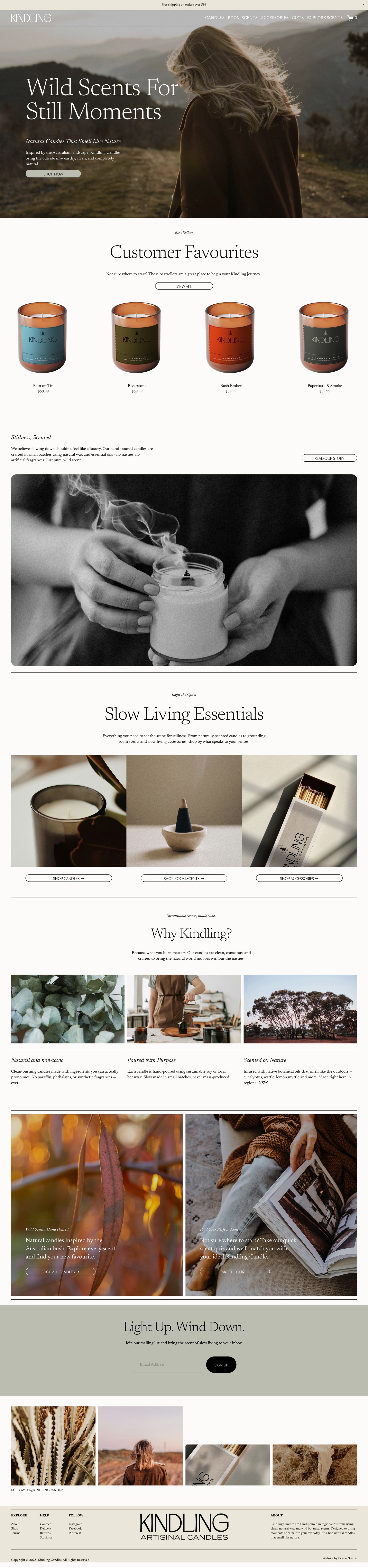
04 WEBSITE DESIGN
Kindling is a small-batch candle brand inspired by Australian country life. The brand needed an identity that felt warm, grounded, and evocative of nature; something that would speak to their connection to the land and their use of earthy, nostalgic scents like dried hay, bush honey, and campfire wood.
What I Did:
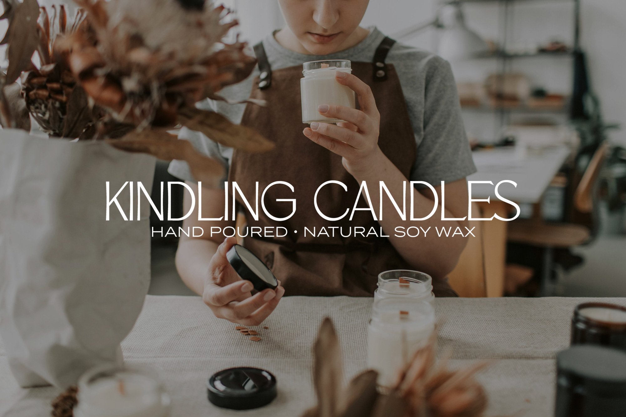
We began with a brand strategy session to define Kindling’s values, audience, and sensory personality. From there, I created a logo suite and identity system that pairs rustic charm with modern simplicity. The primary logo is strong yet soft, with a hand drawn sans serif font reminiscent of vintage general store signage. Supporting icons and illustrations such as native trees were hand-drawn to reflect the brand’s artisanal roots. The earthy colour palette was inspired by natural materials, think clay, ash, ironbark and golden grass.
Paired with recycled textures and muted packaging mockups, the result is a cohesive brand that feels handcrafted, regional, and unmistakably Australian.
The website design carried these elements through to the digital space, using natural textures, calming tones, and intentional white space to mirror the stillness and slowness at the heart of the brand. Key pages were designed to feel inviting and immersive, with curated scent descriptions and lifestyle photography bringing the outdoors in. From the scent quiz to the journal and shop experience, every page was built to reflect Kindling’s sense of place; grounded, warm, and unmistakably regional.
Why It Works:
Kindling’s new branding balances warmth and style, capturing the nostalgic calm of rural living while remaining contemporary and boutique. It gives the business a solid foundation to expand into wholesale, build a lifestyle presence, and stand out in a competitive candle market all without losing its sense of place.