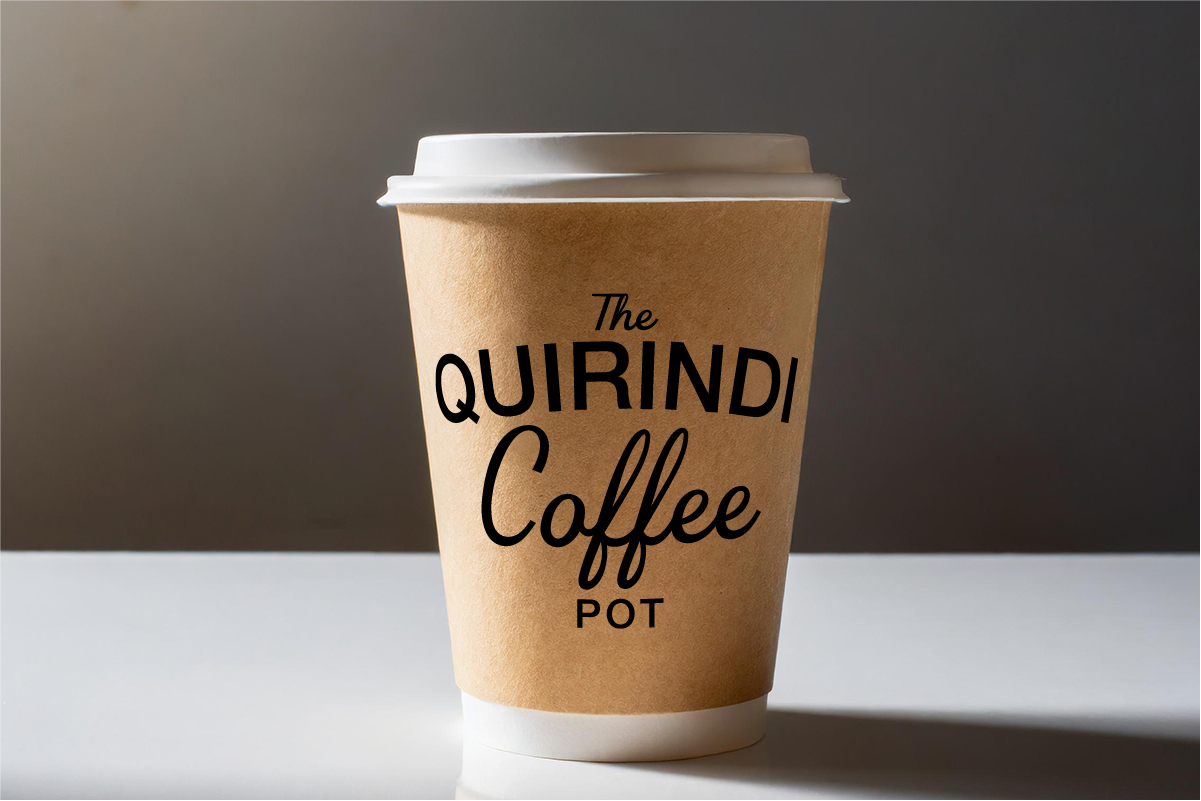
The quirindi Coffee Pot
01 BRAND STRATEGY
02 BRAND IDENTITY
03 COPYWRITING
04 WEBSITE DESIGN
The Quirindi Coffee Pot is a much-loved local café nestled in the heart of regional NSW. When the new owner took over in 2017, she brought a fresh vision to the beloved spot and the brand needed an identity that honoured its history while feeling warm, welcoming, and ready for a new chapter.
What I Did:
We kicked off with a brand strategy session to uncover the café’s story, values, and connection to its community. From there, I developed a brand identity that feels timeless and familiar, just like your go-to morning coffee. The logo draws inspiration from classic coffee shop signage, with a clean, easygoing typeface and a subtle steam motif to hint at the fresh brews served daily.
The website was designed to reflect the cosy, community-first atmosphere of the café. Built with a soft palette of coffee-toned neutrals; think oat milk, espresso, and biscotti, the site balances personality with practicality, showcasing the menu, opening hours, and specials in a way that’s easy for locals and travellers to navigate.
Why It Works:
The new branding and website give The Quirindi Coffee Pot a stronger digital presence without losing the warmth and charm that make it a local favourite. It feels classic yet current, helping the café attract new customers while staying true to its roots in the regional community.


